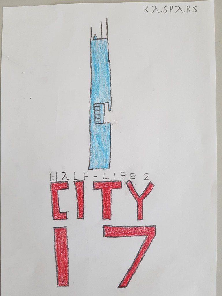


In this slideshow I am showing the minimalist poster I made, I was told to create a minimalist poster from a film or short film I liked. My favourite short film is ‘Escape From City 17’ made by the Purchase Brothers, it is based on a famous video game called Half-Life 2 which was released by Valve in 2004. I made a minimalistic poster where I created, I made a large typography showing ‘Half-Life 2 City 17’ coloured in red. I drew a large Citadel tower at the top of the text coloured in blue.
Next I wrote a review of my favourite short film, I described the overview of the short film and what are the characters intentions, and the atmosphere of the film. I told the pros of the short film where I praise the amazing CGI effects and the detail of costumes, and acting. I also told the cons of the movie where I criticised the movie’s quiet dialogue and I didn’t like the part 2 of the movie because it used weaponry and other things that didn’t fit into the atmosphere of Half-Life 2. The CGI work was a bit janky but it was still good production.
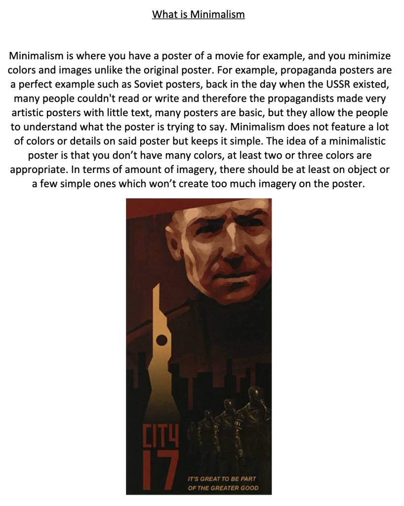
Finally, I explained what Minimalism means, I explained an example of what a minimalistic poster should be, one example is the Soviet Union’s propaganda posters they’ve shown to the public. I shown a Half-Life 2 beta version of the game which shows a minimalistic poster with few colours.

I was tasked to search for two minimal posters from movies which I liked, on the left side there is a star wars series poster with the iconic Death Star planet, on the right there is the Joker movie with the red background, and the iconic revolver that killed a tv anchor during the movie. The reason I chose those posters is because they choose a recognisable object where the viewer could recognise, the colours set a tone in the atmosphere such as the Joker.
